
The fist step here involved creating a Figma project and selecting the size of the frame, which was chosen to be that of an IPhone 16 Pro (or 402x874 pixels). Next, the shapes tool was used to create a variety of basic UI that the ap would be required to have, this includes assets such as buttons, a logo and text (the text was created using the text tool however).
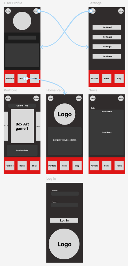
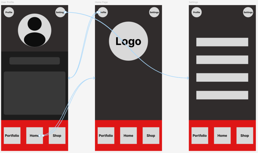
The first of these was the footer menu of the app, inspiration for this was taken from similar companion apps such as the Destiny 2 companion app and the Call of Duty companion app. The footer menu is significant as it will be ever-present throughout the app, and will contain navigation tools to access other important pages (the home, portfolio and shop page). Due to the fact it will be present on most pages, it must both be minimalist in design and size, whilst also being functional and easy to understand. Due to this, multiple variations of this menu were created and tested, by both me and peers, to ensure it felt good to use on a mobile device in addition to not feeling too bulky/obscuring necessary information.
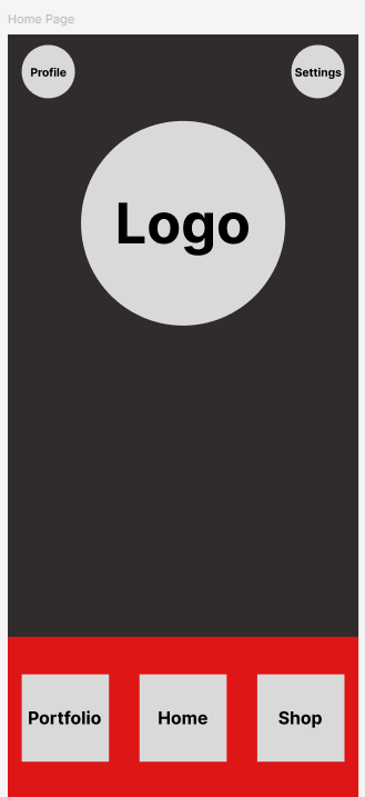
Afterwards, other important aspects were included such as a usable button to access the user profile and settings of the app, both were features identified as important via research. The buttons were placed in the top of the screen and were made smaller, as typically they are features that are less commonly used, and as such aren't needed in the footer menu as it is reserved for commonly travelled to pages. In addition, moving them here ensures that the buttons are both readable and the footer is less cluttered.
This design philosophy was used when creating the other pages, ensuring that each pages function was clear and all buttons remained readable.