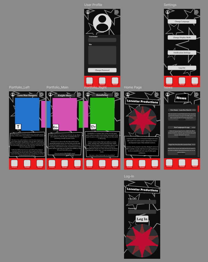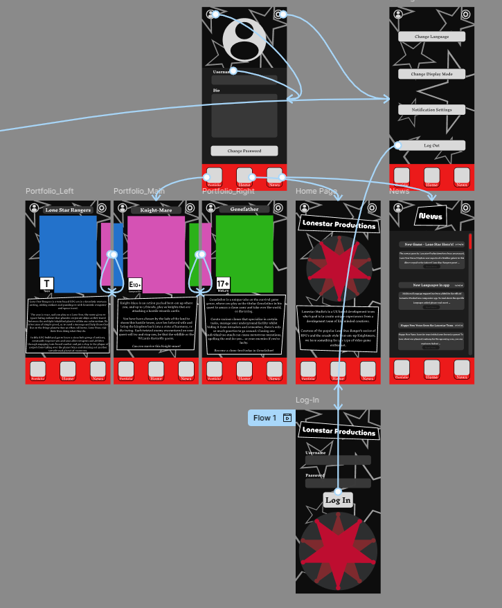

Now the mobile wireframe had been tested and finalised, it was time to create the prototype within Figma. The first step was importing the previous assets into the new project, this wireframe would act as a base for the mobile prototype and ensure that the feeling of the UI remained consistent, messing with it now (after it had been tested by peers) would compromise the convenience of the UI and make the experience overall worse.
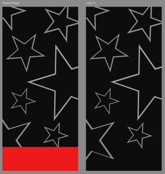
Afterwards, it was time to implement the aesthetic choices made earlier in the project, notably on Figjam. Whilst the main colour pallet was already present in the game, other aesthetic decisions (most notably the inclusion of the star motif) were included now. This star motif relates to both the name and logo, which was made within Adobe Illustrator, of the studio; and the western influence present in the fictional products they offer.
The icons and buttons in the app were designed around a monochromatic colour scheme, using exclusively contrasting blacks and whites to ensure that the buttons stood out. Using component sets, the button would even change states to an inverted version so the audience has feedback that the asset itself can be interacted with and works as a navigation tool.
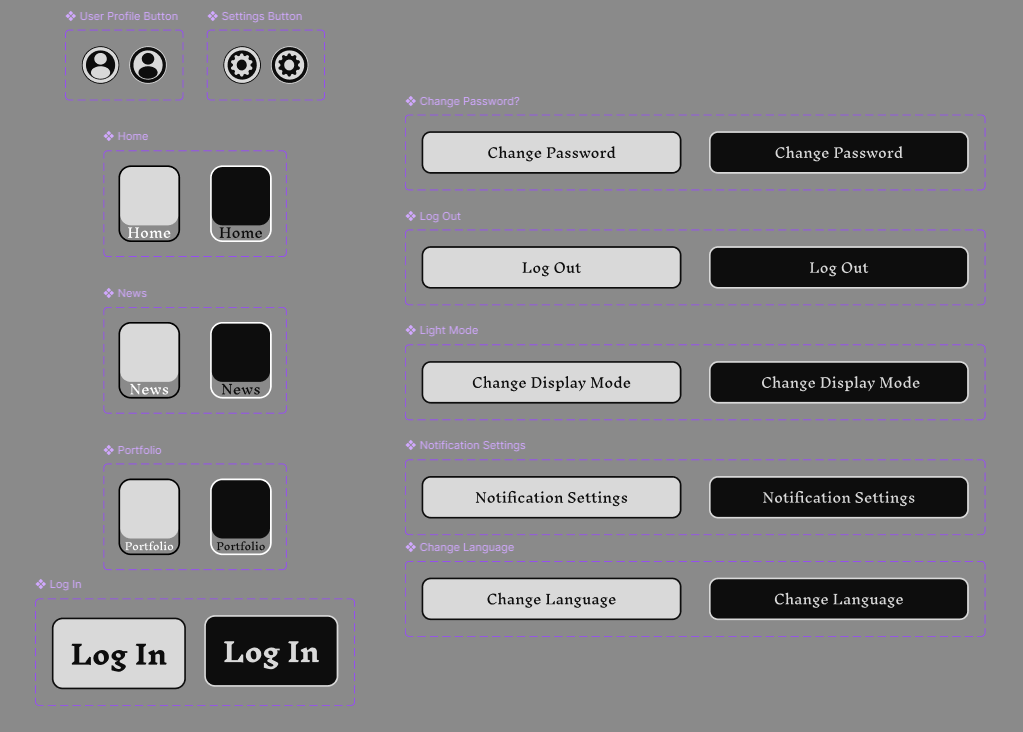
Afterwards, the next step was to add the various other, less essential, aspects of the UI. These, whilst not being functional, ensure that the app itself feels like a complete prototype. These include the various boxes of text that provide necessary information related to the pages they're found upon; non functional buttons that infer about the apps greater functions and features (most notable of them being the language button in settings); and finally, details such as the company logo and the age ratings of the game, which ensure that the app feels more real.
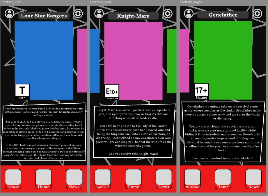
Making the app feel real was an important step here, as whilst it felt convenient and functional, it needed to resemble the apps that were used as inspiration.