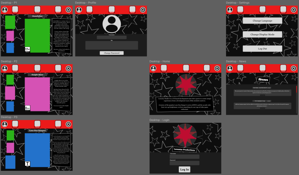

The last of the steps was to adapt the mobile prototype to a web based prototype. The first step in this process, was to change the frame that the various assets were contained within from a mobile to that of a desktop, specifically that of the Desktop frame in Figma. In addition, key aesthetic aspects were migrated over from the mobile project: these include the stars in the background and the iconic red footer (which had been changed to a header to be more inline with other websites).
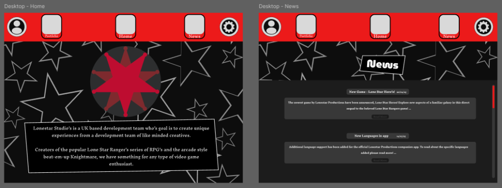
The mobile app was used heavily as a framework for the web version, frequently migrating assets between the projects to ensure that the assets created were in line with the aesthetic choices of the mobile app. This includes; The navigation buttons found within the header (including the profile and option buttons), that retain their functionality and changing when hovering; The customisable text boxes created to enhance the outlaw and wild west aesthetic, as well as the text found within; And finally the smaller aesthetic items such as the company logo and the age ratings for the fictional games.
Most of the time spent adapting the mobile app to a desktop version was that of recreating the various pages, simply to fit a desktop rather than a mobile device. The pages have been faithfully adapted into this new format, the biggest change being that of the portfolio pages.
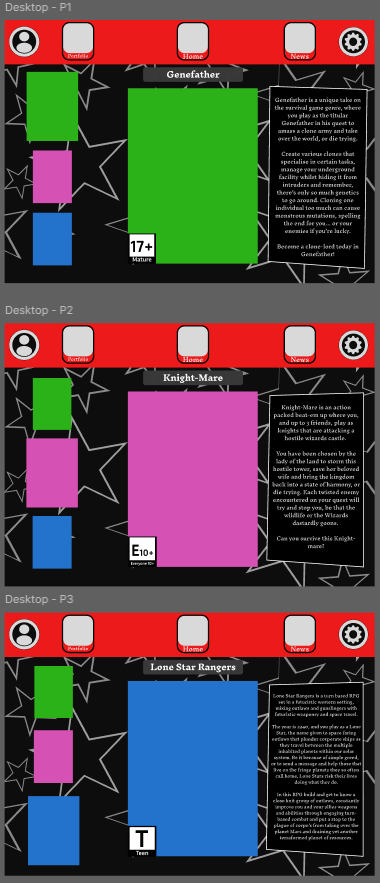
Due to the different frame, the previous format of the portfolio pages didn't work, and after some time it was decided that it would be necessary to re-format the pages. Here, the user can still easily access each game (by clicking on them in the side menu) and access any information relating to them, but it also clearly shows the user which game they are currently viewing, for a more fluid user experience.